

How To Design An Effective Transport Truck *Ad*
*1. LESS IS MORE – KEEP IT SIMPLE*. Your ad should be a clear and brief expression of one idea.
*2. RULE OF THUMB: 7 WORDS OR LESS. *Use short simple words with quick and easy comprehension and limit or eliminate punctuation.
*3. FIVE TO SEVEN SECONDS*. Your target audience could be traveling at 100 km per hour passing your ad – does your message communicate effectively within 5-7 seconds?
*4. LARGE BOLD (SIMPLE) FONTS, EXTRA SPACING, DROP SHADOWS. *Your goal is for people to be able to read your message from as far away as possible.
*5. CONTRASTING COLOURS*. High color contrast is the key to good readability. Colors that work best are black, white and bold, primary
colors like red, yellow and blue. Black text on yellow rates the highest in readability. Avoid: brown, earth tones, pastels.
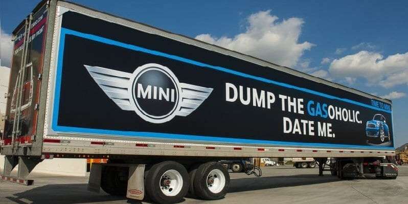
*6. USE A SINGLE IMAGE*. One large image will attract the reader’s eye to the billboard.
*7. SIMPLE BACKGROUND*. The background should not interfere with your image, copy or logo. Too much blank space isn’t a good thing. Use blank space and make your fonts, image and logo bigger.
*8. CALL TO ACTION. *Your web site is the perfect call to action. Include your phone number if you must but that’s enough.
Big Rig Wraps Transport Truck Advertising (Big Rig Wraps) is the premier provider of large-scale outdoor advertising on trucks up to 53 feet. Through a series of partnerships created with fleet truck owners, graphic designers, and certified installers, we make it possible and affordable for companies to take their advertising on the road, locally, regionally, nationally and internationally, even if they don’t own their own fleet. Learn more about Big Rig Wraps here.